Merchants at The Home Depot are considered mini-CEOs of a department, class, or subclass of SKUs (products). My designs provided the merchant community with visibility into their top-selling SKUs in order to increase sales dollars and stay on top of their strategies.
Role & Timeline:
User Experience Intern
May - July 2023
Scope and Deliverables
Key findings and high-fidelity designs, developed and implemented by my intern team Jack (PM), Harsha, and Hannah (Dev)
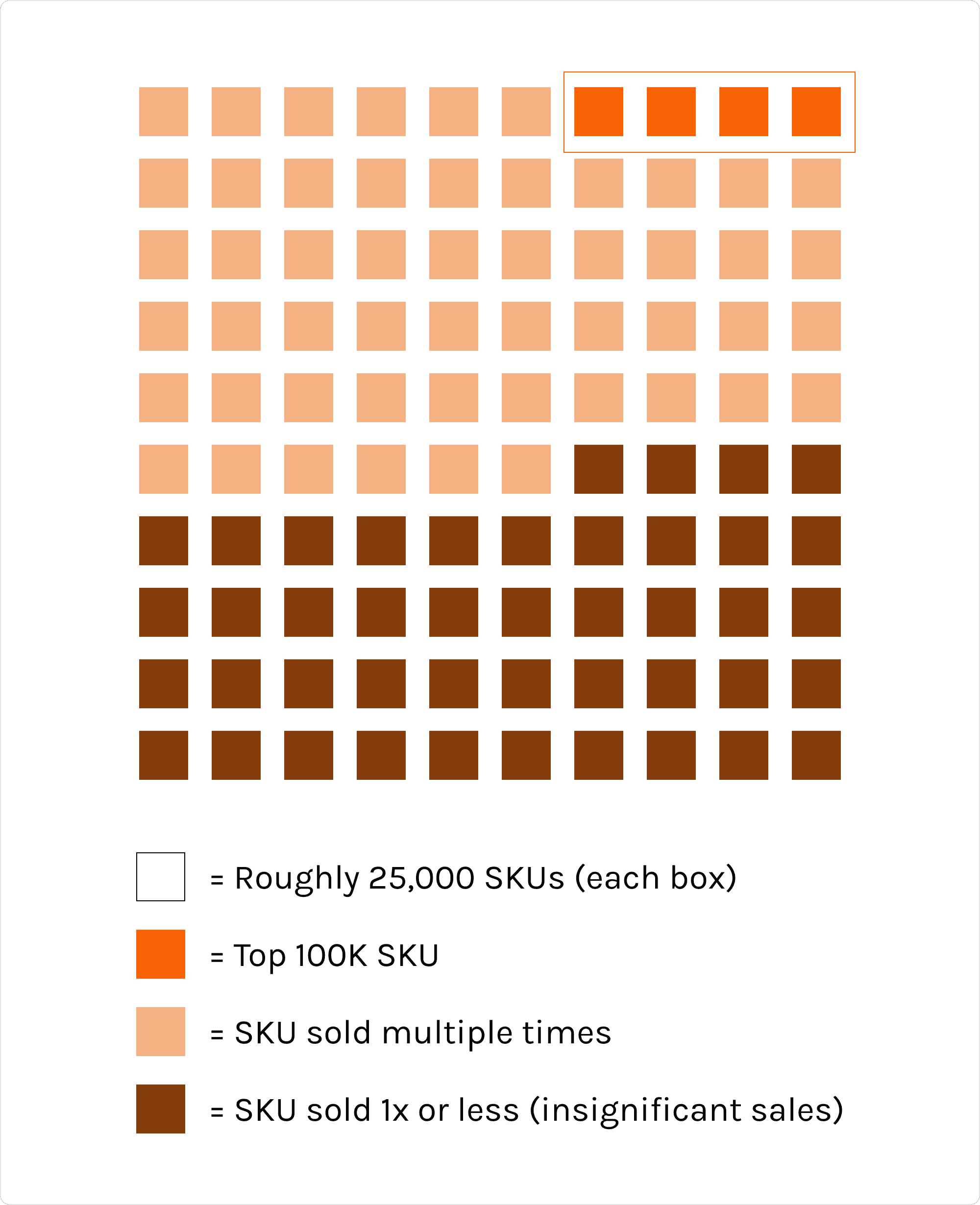
At The Home Depot, the 100,000 highest-selling SKUs represent less than 4% of all SKUs, yet make up almost 90% of R12 annual sales. Currently, merchants have no way of knowing which of their SKUs lie within the top 100,000.The effort to provide emphasis on SKUs in order to increase revenue is known as the “Top 100K SKUs Initiative,” and is an enterprise-wide initiative at the company.
I interviewed 6 different merchant teams including Core merchants, Online merchants, Senior Online Merchant Analysts, and Merchandising Planners. Using a prototype walkthrough structure, I asked participants to walk through a prototype of MPulse with some initial design updates. I measured the efficacy & usefulness of designs through prompted questions and observations, then collaborated with my mentor and broader team in a design studio to synthesize my research findings through affinity mapping.

Key findings summarized
After grouping and mapping data points and quotes from my research, we summarized our key findings into 3 main points centered around clarity, convenience, and customization:
Clarity: Merchants found it unclear whether the Top SKUs shown throughout the prototype referred to their own individual top SKUs, online SKUs, core SKUs, or enterprise-wide SKUs.
Convenience: Merchants are busy people and would like to access top SKU data in as little time and few clicks as possible.
Customization: Both core and online merchants differ greatly in the number and types of DCS
and individual SKUs that they manage.
Based on these key findings, we developed a clear problem statement:
“How might we communicate top SKU data in a way that meets these varied needs?”

A birds-eye view of some of the process in grouping research findings together
#Thankyou
My first internship at The Home Depot was so incredible, and I learned so much about designing in industry, collaborating in a balanced team with other interns, and navigating growth as a new designer. I’d like to give a special thank you to my intern team that was so fun to work and collaborate with, as well as my mentor Aric and my manager David, for making this internship experience so enjoyable.
To view this case study more in-depth, please reference the slide deck here!
Though parts of this work cannot be shared publicly, please contact me at zeyabdu@gmail.com if you have any lingering questions!

Design updates
I developed three broad design recommendations: renaming, reorganization, and providing more context in regard to Top SKU visibility.
Performance Widget: Since surfacing a list of individual SKUs wasn’t technically feasible, added a count of the # of SKUs within each group to increase visibility and provide more context for the data being displayed. Also renamed the Performance Widget Tab to “THD Top SKUs” and reorganized the SKU sets into two different groups: “SKU Rank 1-20K” and “SKU Rank 20K-100K.” This helps clarify that they are two separate groups and also provides context that the 100K group does not include those SKUs that ranked between 1-20K.
MKSU column: Adjusted wording from “Top SKU Rank” to “Top 100K SKU,” and adjusted placement next to sales so it would be grouped with other quantitative data and fit users’ mental model of the tool.
Throughout: Included a hover over so that a definition is provided across all pages, and updated the text to clarify that enterprise refers to in-store and online sales within THD USA.
Towards the end of my first internship at The Home Depot, I delivered my research report-out presentation to the entire Merchandising & Pricing Team, where I shared my research report and feature updates for the Performance Widget, Single SKU, and Multi-SKU pages. I also shared my features during the company’s weekly MPulse Demo, where merchants were able to begin using the features that my team delivered. Jack, Harsha, Hannah, and I made up the first intern team within Pricing ever to ship a product during our time as interns.
Some specific learnings from this incredible experience include:
Developing user research protocol
Developed an in-depth research and interview guide before meeting with merchants
Being that they’re incredibly busy, time-sensitive individuals, I needed to make sure that every question I asked was delivered with a purpose
Ensuring consistency + alignment with other branded tools
Discovering what the design process looks like at THD by:
Studying documentation
Reaching out to designers within the Enterprise UX (EUX) Team for coffee chats
Attending design stand-ups, all-hands, and work sessions to see what design collaboration looks like
Exploring other THD tools to see if they’ve already solved or addressed the problem
Asking for help and feedback
Attending and presenting at design critiques to receive feedback from fellow designers
Reaching out to designers within EUX to chat and see how they’d approach problems
Sharing progress with my product team, mentor, manager, and Merch UX team!
Investing in my own growth and personal development as a designer
Learning as much as I can
Owning my current strengths + weaknesses as a designer (Korn Ferry competencies)
Results and Reflections
As a User Experience Intern...
My team and I added pricing visibility to MPulse, The Home Depot’s primary sales analytics tool used by merchants. With this visibility, merchants can be more proactive in managing their best-selling SKUs and increasing their sales. i interviewed 6 different merchant teams using a prototype walkthrough structure and, based on my findings from this research, created design updates for three different parts of MPulse— the Performance Widget, the Multi-SKU page, and the Single SKU Page.
Top SKUs make up the vast majority of company revenue